Copyright © 2024 Phucph. All Rights Reserved.
Hanoi, Vietnam
Copyright © 2024 Phucph. All Rights Reserved.
Copyright © 2024 Phucph. All Rights Reserved.
Hanoi, Vietnam
Copyright © 2024 Phucph. All Rights Reserved.
Hanoi, Vietnam

Make Finhay consistent,
centralized, and human-centric
with Tree Design System
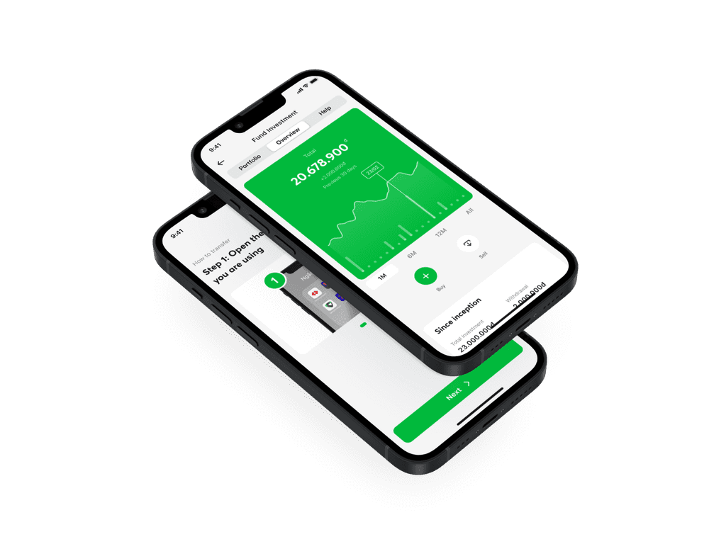
Finhay is a personal investment platform for 3M+ Vietnamese users
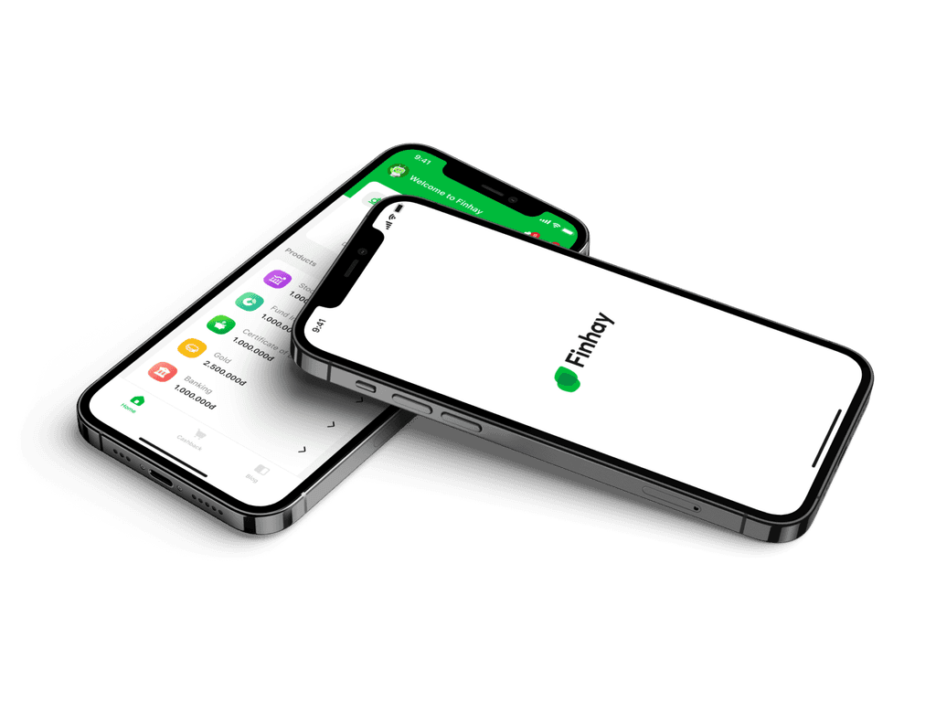
Make Finhay consistent, centralized, and human-centric with Tree Design System
Finhay is a personal investment platform for 3M+ Vietnamese users
Make Finhay consistent, centralized, and human-centric with Tree Design System
Finhay is a personal investment platform for 3M+ Vietnamese users
Principles
Principles
Bring Finhay product designs to international quality 🌍
Bring Finhay product designs to international quality 🌍
📑
📑
Consistency
Consistency
Ensure language and images align with real-world customer experiences.
Strictly adhere to rules, and opt for a minimalist design to enhance consistency.
Ensure language and images align with real-world customer experiences.
Strictly adhere to rules, and opt for a minimalist design to enhance consistency.
💬
💬
Response
Response
Always focus on users' task-related responses.
Follow-up responses should offer flexibility through images, sounds, interactions, or text.
Always focus on users' task-related responses.
Follow-up responses should offer flexibility through images, sounds, interactions, or text.
✋
✋
Control
Control
Users are always in control, with the right to cancel, exit, or continue.
Hints is essential to assist users in predicting their next actions.
Users are always in control, with the right to cancel, exit, or continue.
Hints is essential to assist users in predicting their next actions.
👁️
👁️
Focus
Focus
Always offer essential information and actions based on the context of use.
Proactively eliminate irrelevant decorations or content.
Always offer essential information and actions based on the context of use.
Proactively eliminate irrelevant decorations or content.
👤
👤
Human
Human
Place people at the core of the product design process.
Fully commit to user accessibility and attention standards.
Place people at the core of the product design process.
Fully commit to user accessibility and attention standards.
💌
💌
Metaphor
Metaphor
Offer users with a sense of authenticity and closeness.
A familiar experience will encourage users to develop a habit with the product.
Offer users with a sense of authenticity and closeness.
A familiar experience will encourage users to develop a habit with the product.
Styles
Styles
Keep every user interface in the
same rhythm 🎧
Keep every user interface in the
same rhythm 🎧
🍱
🍱
Layout grid
Layout grid
🎨
🎨
Color
Color
🔤
🔤
Typography
Typography
📦
📦
Others
Others
Layout grid
Layout grid
A strong foundation for sustainable designs 🧱
A strong foundation for sustainable designs 🧱
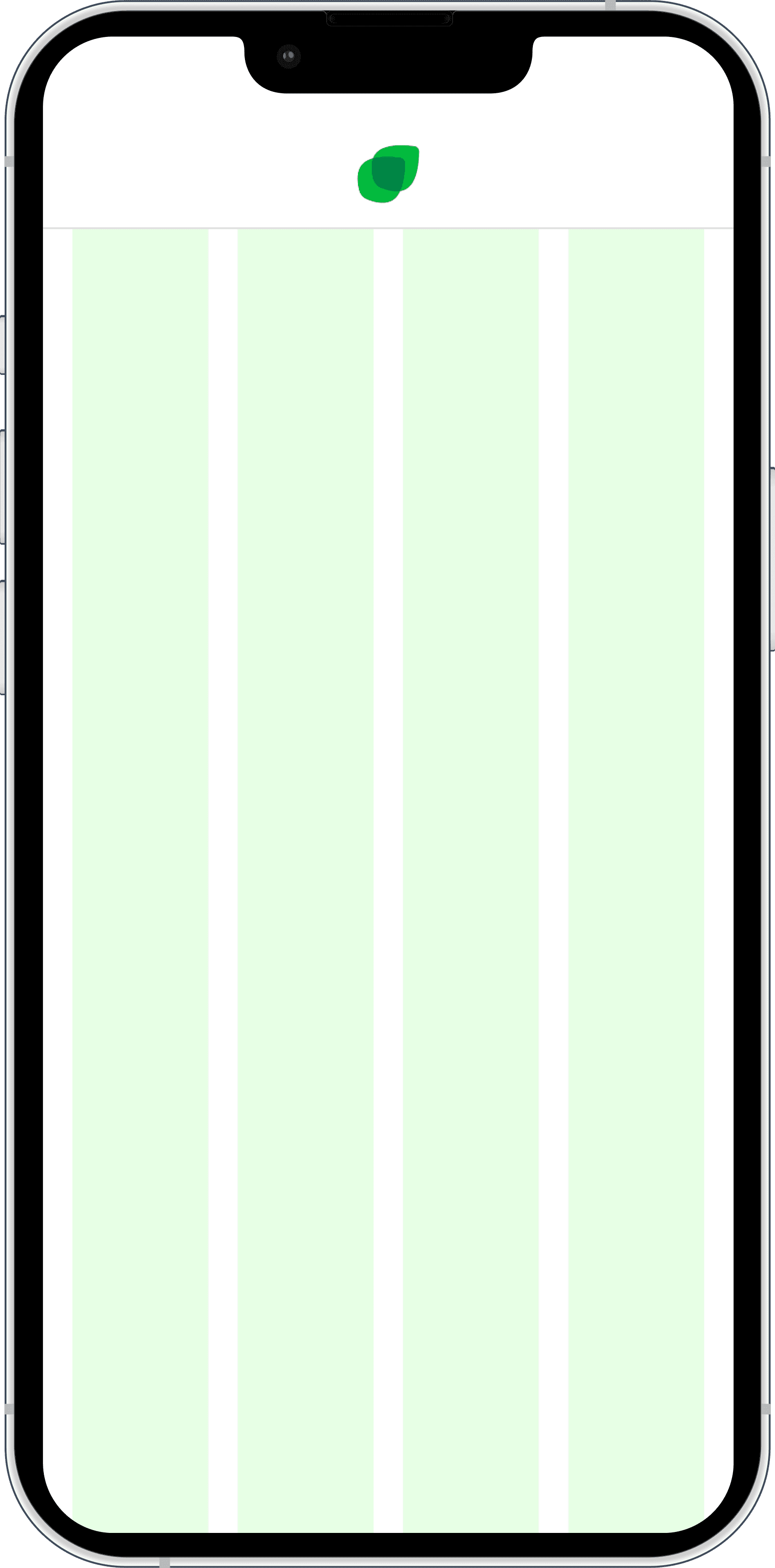
Mobile
Mobile
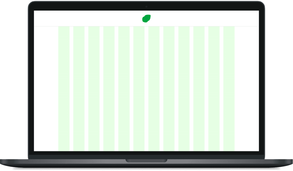
Count 04. Type Stretch. Column width Auto. Gutter 16. Margin 16.
Count 04. Type Stretch. Column width Auto. Gutter 16. Margin 16.
Desktop
Desktop
Count 12. Type Center. Column width 72. Gutter 24. Margin Auto.
Count 12. Type Center. Column width 72. Gutter 24. Margin Auto.
Color
Color
Elements for vibrant & human-centric designs 💚
Primary
Primary
The brand-unique green 🍀
The brand-unique green 🍀
Primary 500
Neutral
Neutral
Pure neutral color presented below 🌚
Pure neutral color presented below 🌚
Neutral 600
White 500
Semantic
Semantic
Common meaningful colors for additional information 🚦
Common meaningful colors for additional information 🚦
500
500
500
500
500
100
100
100
100
100
100
100
100
100
100
More+
More+
Decorative colors for other purposes 🎨
Using decorative colors for purposes 🎨
Green Yellow
Green yellow
Amber
Pacific blue
Denim blue
40+
Typography
Create a sense of completeness for
presented content 💌
Headline
Averta for Finhay - Brand typeface of Finhay 🍀
Averta for Finhay - Brand typeface of Finhay 🍀

Icon type
Tree Icons - Symbol typeface of Finhay 🍀
Tree Icons - Symbol typeface of Finhay 🍀

Others
SF Pro Text & Roboto - Default OS typefaces ⚙️
SF Pro Text & Roboto - Default OS typefaces ⚙️
Other styles
Spacing
Arrange different elements by horizontal & vertical standard 🧭
Arrange different elements by horizontal & vertical standard 🧭
Name
Specs
Example (8:1)
3XS
4
2XS
8
XS
12
S
16
M
20
L
24
XL
32
2XL
40
3XL
44
4XL
64
5XL
80
Elevation
Arrange different elements by depth 🔮
Arrange different elements by depth 🔮
Layer 1
Layer 1
Layer 1
Flat
Flat
Share to support 👍
Share to support 👍
Layer 2
Layer 2
Layer 2
Single drop shadow
Single drop shadow
X=0, Y=4, B=20, S=0, #000000, 10%
X=0, Y=4, B=20, S=0, #000000, 10%
Layer 3
Layer 3
Layer 3
Single drop shadow
Single drop shadow
X=0, Y=8, B=24, S=0, #000000, 10%
X=0, Y=8, B=24, S=0, #000000, 10%
Layer 4
Layer 4
Layer 4
Single drop shadow
Single drop shadow
X=0, Y=12, B=32, S=0, #000000, 10%
X=0, Y=12, B=32, S=0, #000000, 10%
Corner radius
Use figurative details to create friendliness and modernity ✨
Use figurative details to create friendliness and modernity ✨
Name
Specs
Example (1:1)
XS
4
S
8
M
10
L
12
XL
20
UI Components
UI Components
Maintain the consistency of every
user interface 🫡
Maintain the consistency of every
user interface 🫡
🍀
🍀
App icon
App icon
👆
👆
Button
Button
🔆
🔆
Iconography
Iconography
🖼️
🖼️
Illustration
Illustration
🏠
🏠
Tab bar
Tab bar
✍️
✍️
Text field
Text field
🚸
🚸
Alert popup
Alert popup
🗑️
🗑️
Empty state
Empty state
📦
📦
Others
App icon
The first interaction between users and Finhay app 🤚
Guideline
Guideline
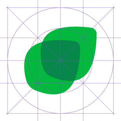
Strictly follow Google Play Store & App Store's guidelines 🛍️
Strictly follow Google Play Store & App Store's guidelines 🛍️
App Store
App Store

Google Play Store
Google Play Store
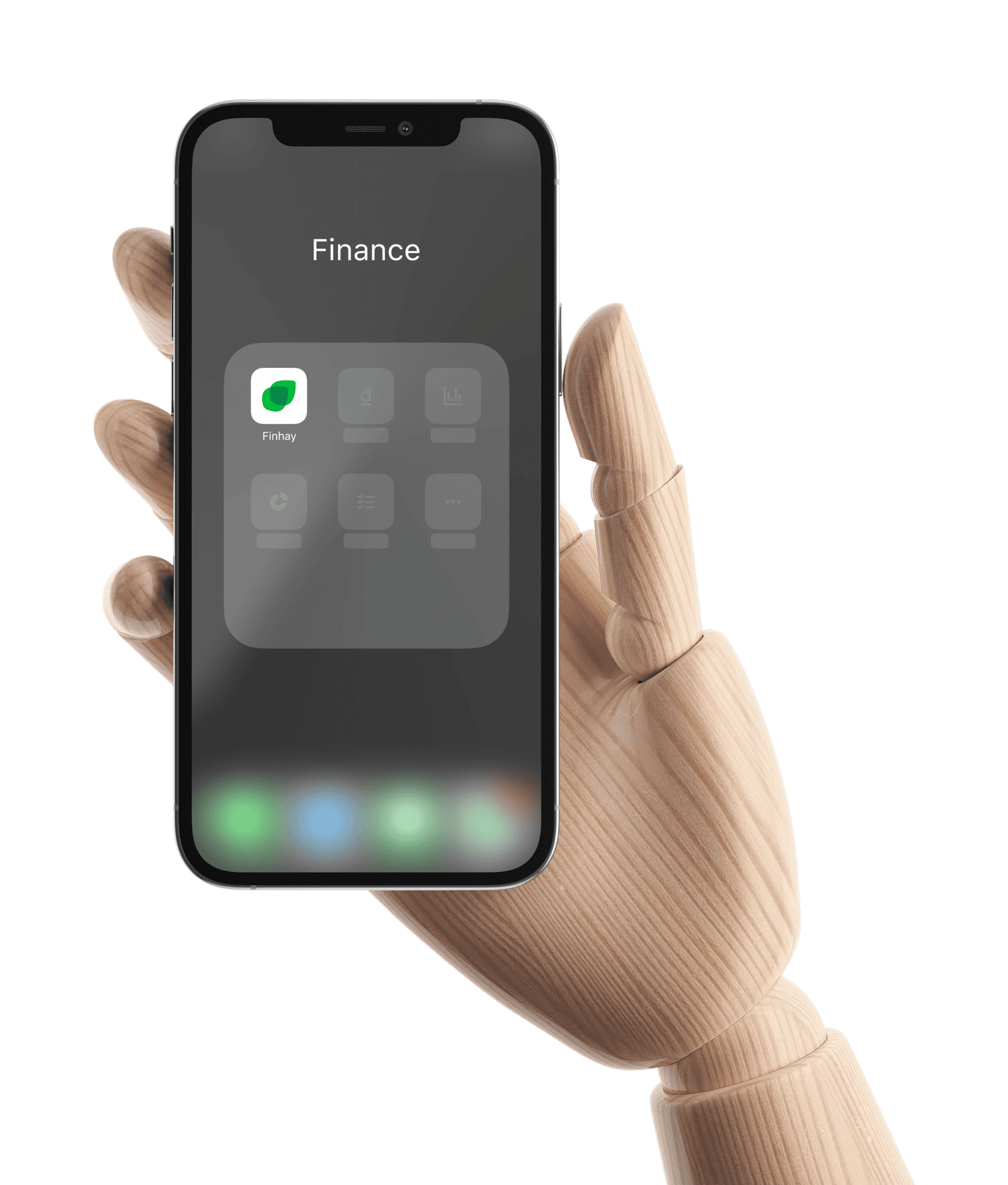
Iconography
Iconography
Add the proximity and simplicity for a wonderful experience 💫
System icons
System icons
Supplement for illustrative content & systemic features ⚙️
Supplement for illustrative content & systemic features ⚙️
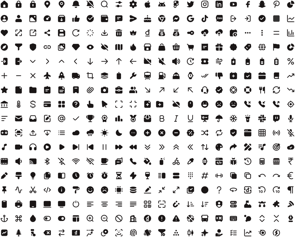
Product icons
Product icons
Represent each Finhay's core product 🍀
Represent each Finhay's core product 🍀
Sub-product icons
Sub-product icons
Represent sub-products inside 🗂️
Represent sub-products inside 🗂️


More+
More+
Represent brands, rankings, payment types, etc...
Represent brands, rankings, payments, etc.
Illustration
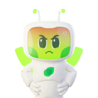
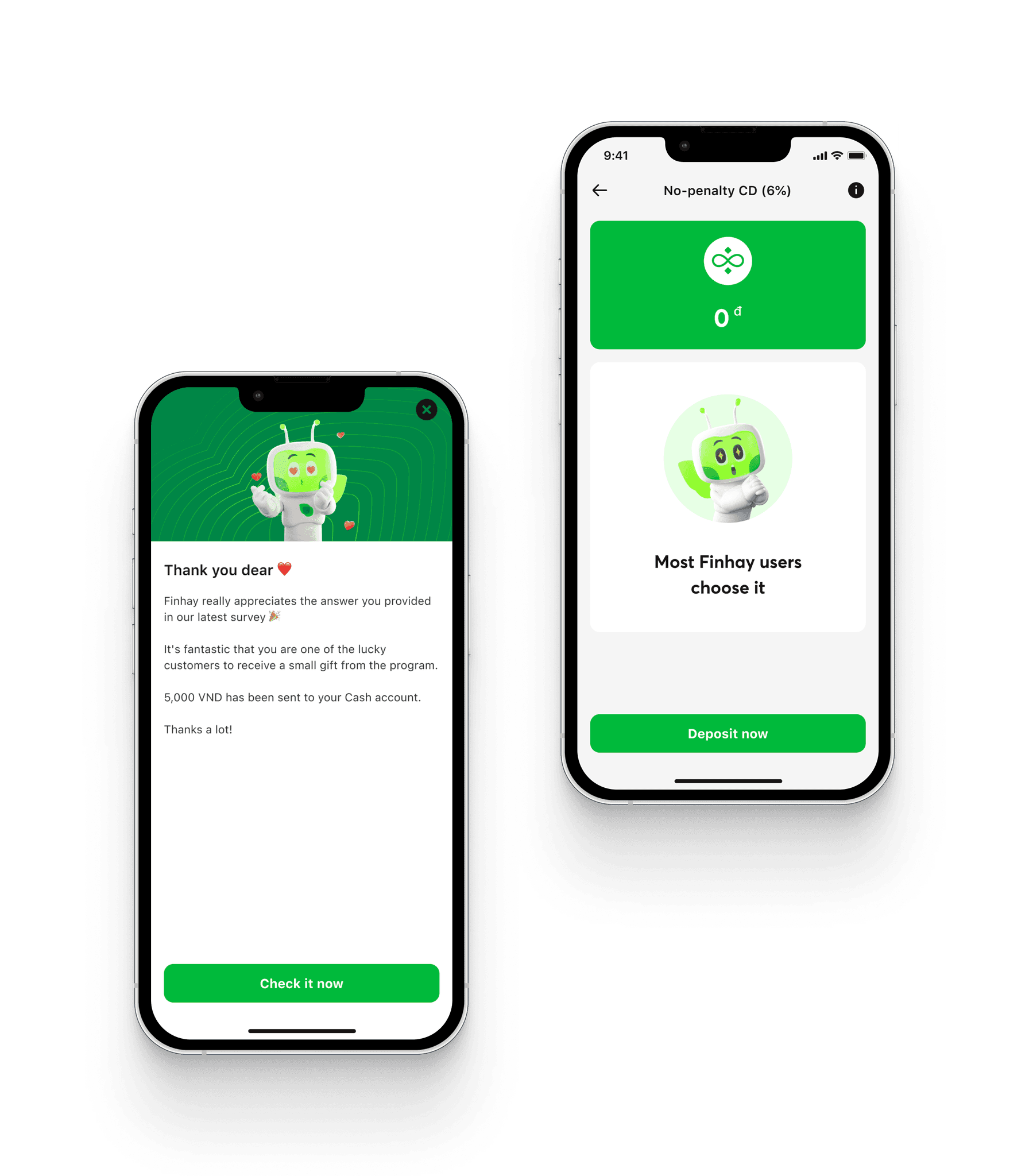
Use Finhay's signature mascot for enhanced
brand recognition ⭐️







Tab bar
Entrance for the most important portals in
this platform 🔐
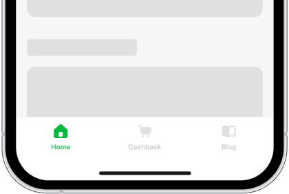
Home
Home
Access to the prime content
Access to the prime content
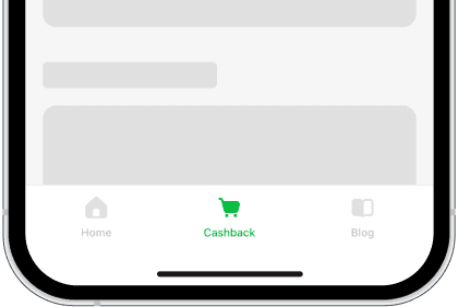
Cashback
Cashback
Shop at various brands for unlimited cashback
Shop at various brands for unlimited cashback
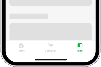
Blog
Blog
View all articles focused on the financial market
View all articles focused on the financial market
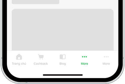
More+
More+
Enable personalized adjustment of tab bar (maximum 5 icons)
Enable personalized adjustment of tab bar (maximum 5 icons)
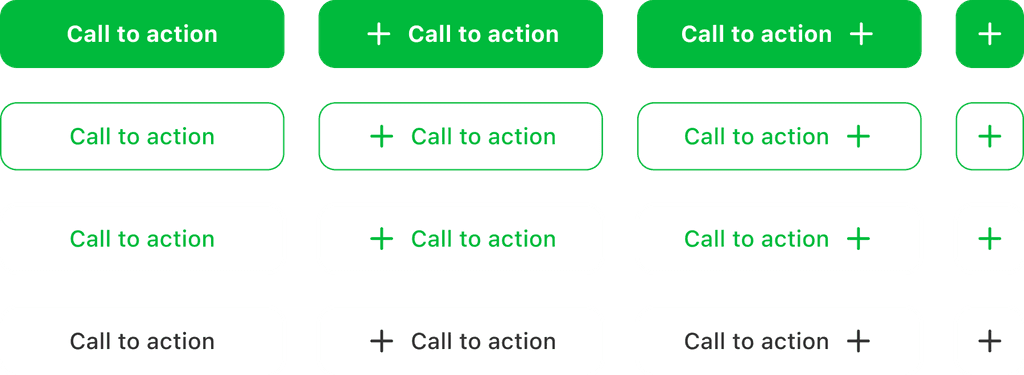
Button
Primary ways to execute tasks 🤌
Retangle button
Retangle button
Construct the connection between various elements in one interface 🔗
Construct the connection between various elements in one interface 🔗
Circle button
Circle button
Construct the independence from other elements in one interface 🎭
Construct the independence from other elements in one interface 🎭

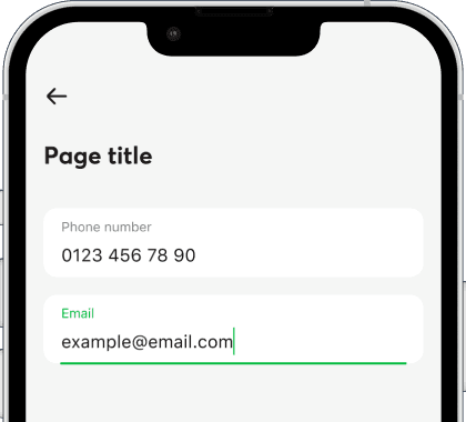
Text field
Enable users to fill in essential information 📝
Normal text
Normal text
Use for normal information
Use for normal information
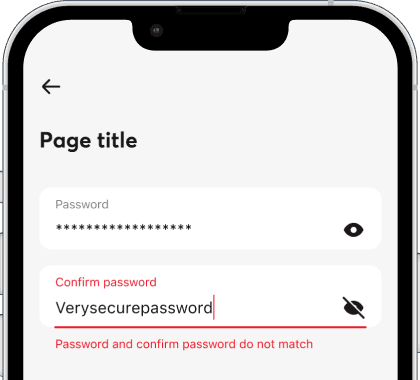
Password
Password
Use for secured information
Use for secured information
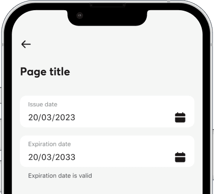
Date picker
Date picker
Use for date time information
Use for date time information
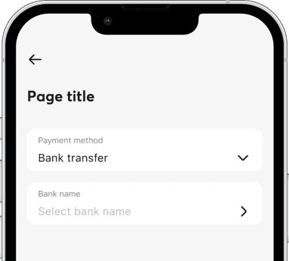
Dropdown & Selector
Dropdown & Selector
Use for a cluster of information within a designated group
Use for a cluster of information within a designated group
Alert popup
Provide important guidelines 💡
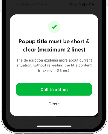
Success popup
Success popup
Confirm task completion
Confirm task completion
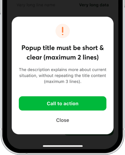
Warning popup
Warning popup
Inform possible mistakes
Inform possible mistakes
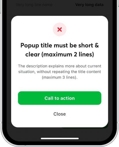
Error popup
Error popup
Verify occurred mistakes
Verify occurred mistakes
Empty state
Confirm an empty state and suggest
possible actions 🗑️
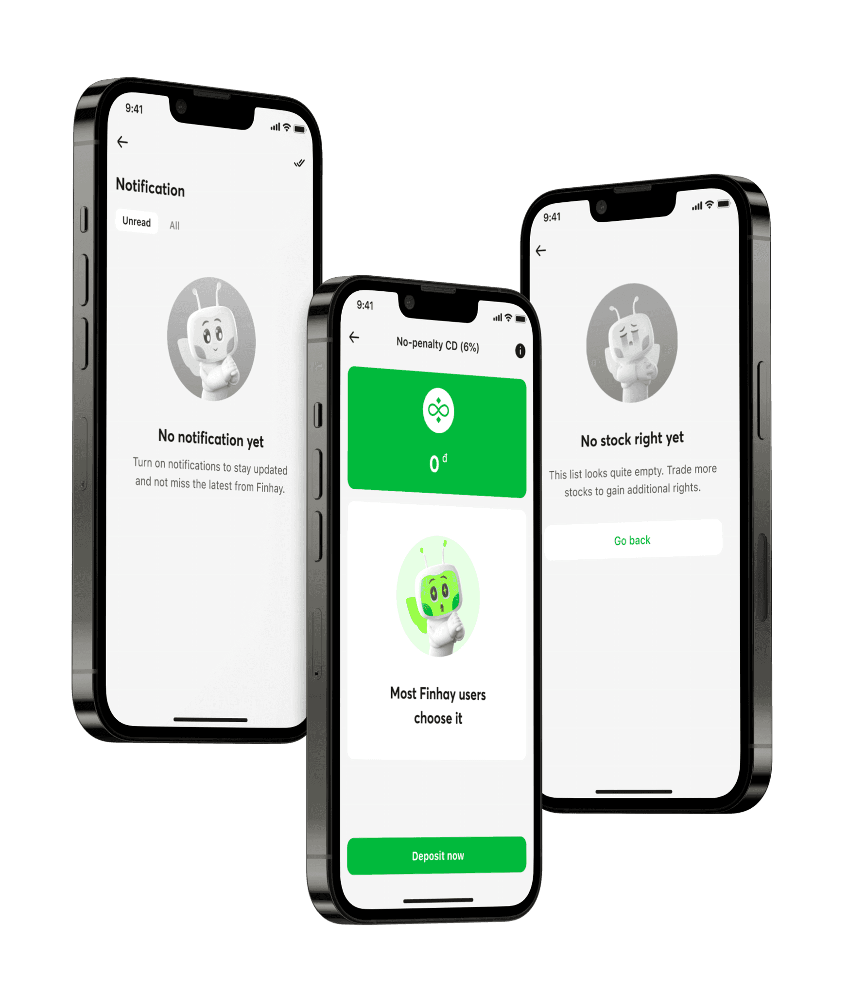
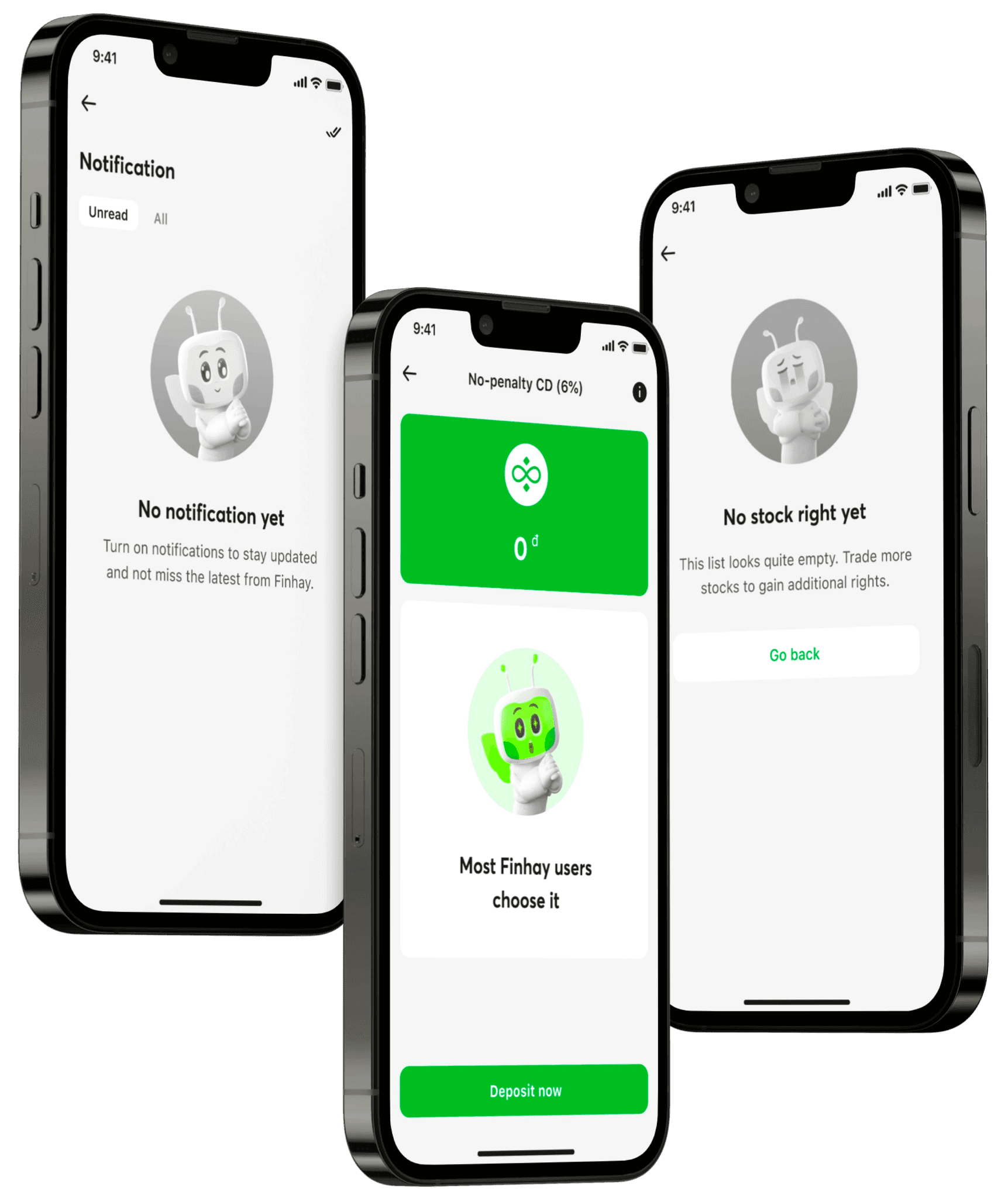
Other components
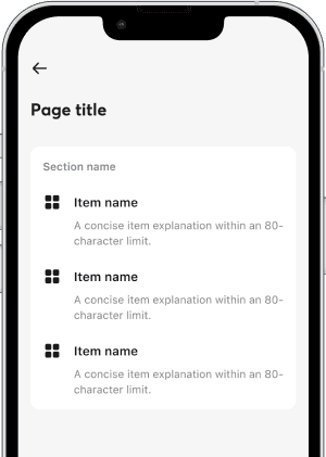
Card
Card
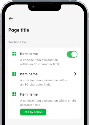
Quickly deliver transparent content 🚀
List view only. Clear navigation. Whitespace rather than divider.
Quickly deliver transparent content 🚀
List view only. Clear navigation. Whitespace rather than divider.
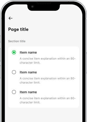
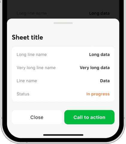
Bottomsheet
Bottomsheet
Enable an independent content delivery without disruptions to the main flow
Enable an independent content delivery without disruptions to the main flow
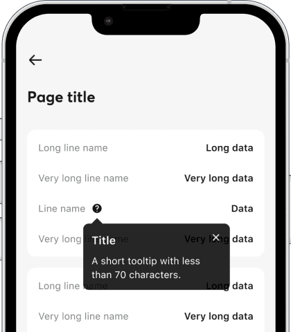
Tooltip
Tooltip
Provide the user with additional information when needed
Provide the user with additional information when needed

More+
More+
Various components to systemize user interfaces
Various components to systemize user interfaces
Onboarding
Onboarding
Notification
Notification
Snackbar
Snackbar
Tab
Tab
Badge
Badge
Tag
Tag
Logo
Logo
...
...
Demo
Demo
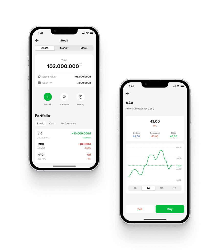
Example screens with the aid
of Tree Design System
Example screens with the aid of Tree Design System
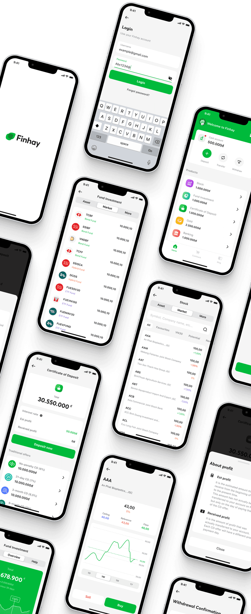
More & more
More & more
Thousands of screens have been generated using Tree Design System 🍀
Contributors
Contributors
Thank you for scrolling almost 40K pixels 🫶
Thank you for scrolling almost 25K pixels 🫶
Thank you for scrolling almost
40K pixels 🫶

Le Phuong Anh
Le Phuong Anh
Lead Designer
Lead Designer
Lead Designer
@lephuonganh2205
@lephuonganh2205
@lephuonganh2205

Pham Hong Phuc
Pham Hong Phuc
Designer
Designer
Designer
@phucphdesign
@phucphdesign
@phucphdesign

Others
Others
All our CX members who have been together 😍
All our CX members who have been together 😍
All our CX members who have been together 😍
